


\"Angry Kirby\" Explained by Former Nintendo Employees
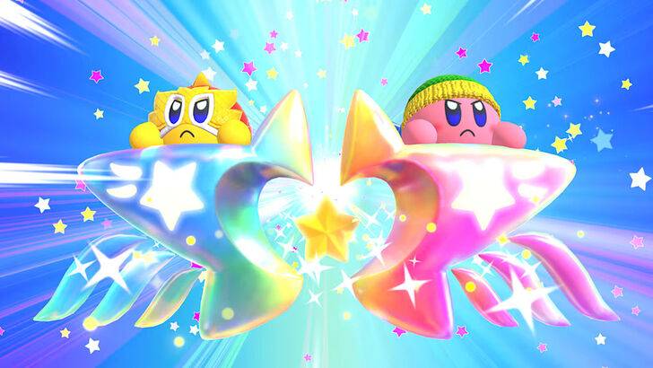
The Evolution of Kirby's Image: From "Angry Kirby" to Global Consistency

This article explores the fascinating evolution of Kirby's marketing and localization, focusing on the differences between his Japanese and Western portrayals. Former Nintendo employees shed light on the strategic decisions behind the iconic pink puffball's transformation.
The "Angry Kirby" Phenomenon
The term "Angry Kirby" emerged from the noticeably fiercer, more determined look adopted for Western game covers and artwork. Leslie Swan, former Nintendo Localization Director, clarifies that the intention wasn't to portray anger, but rather a sense of resolute determination. While cute characters resonate broadly in Japan, the perception in the US suggested a tougher image would appeal more to tween and teen boys. Shinya Kumazaki, director of Kirby: Triple Deluxe, corroborated this, noting that while cute Kirby drives Japanese appeal, a more battle-hardened Kirby resonates more strongly in the US market. However, he also pointed out that this wasn't universally applied, as Kirby Super Star Ultra featured a tougher Kirby on both US and Japanese box art.
Marketing Kirby: Beyond "Kiddie"
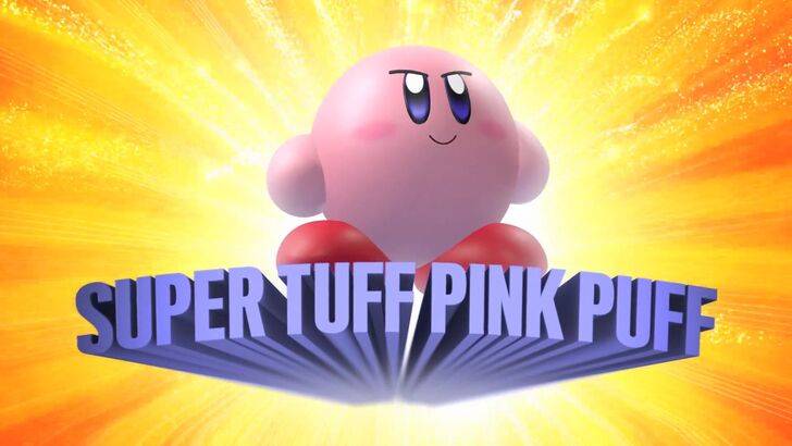
Nintendo's marketing strategy aimed to broaden Kirby's appeal, particularly among boys. The "Super Tuff Pink Puff" tagline for Kirby Super Star Ultra exemplifies this shift. Krysta Yang, former Nintendo of America Public Relations Manager, explains that Nintendo sought to shed its "kiddie" image, aiming for a more mature appeal within the gaming industry. The focus shifted from Kirby's inherent personality to emphasize the gameplay and combat aspects of the games, aiming to attract a wider demographic. While there's been a push to create a more well-rounded character, Kirby's cuteness remains his defining trait.
Localization Differences: A Historical Perspective
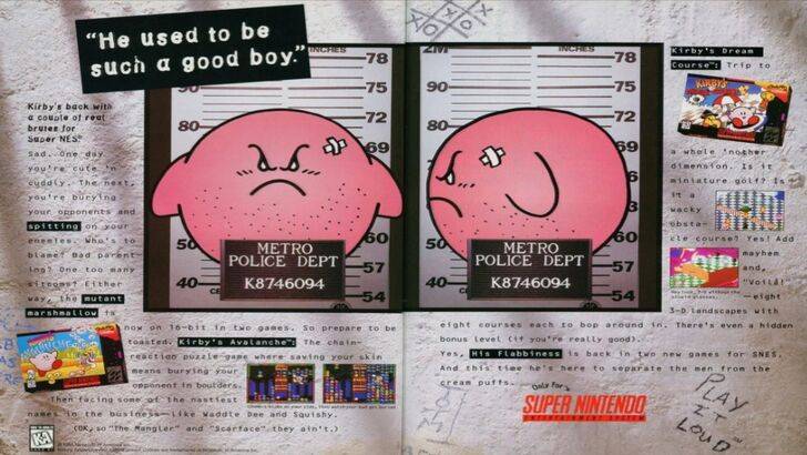
The divergence in Kirby's localization began early, notably with a 1995 "Play It Loud" advertisement featuring a mugshot-style Kirby. Subsequent years saw variations in his facial expressions across game box art, with titles like Kirby: Nightmare in Dream Land, Kirby Air Ride, and Kirby: Squeak Squad depicting a more serious, almost stern Kirby. Beyond facial expressions, even Kirby's color was altered. The original Kirby's Dreamland for Game Boy featured a ghostly white Kirby in the US release due to the monochrome display, contrasting with his pink hue in the Japanese version. This discrepancy, coupled with the perception of a pink character as unappealing to the target demographic, led to further adjustments in his portrayal.
A More Global Approach
In recent years, Nintendo has adopted a more unified global strategy, fostering closer collaboration between its American and Japanese offices. This has resulted in more consistent marketing and localization, minimizing regional variations like those seen in Kirby's box art. While this ensures brand consistency, it also risks overlooking regional nuances, potentially leading to more generic marketing. However, the increasing familiarity of Western audiences with Japanese culture has also influenced this shift, blurring the lines between regional preferences.
-
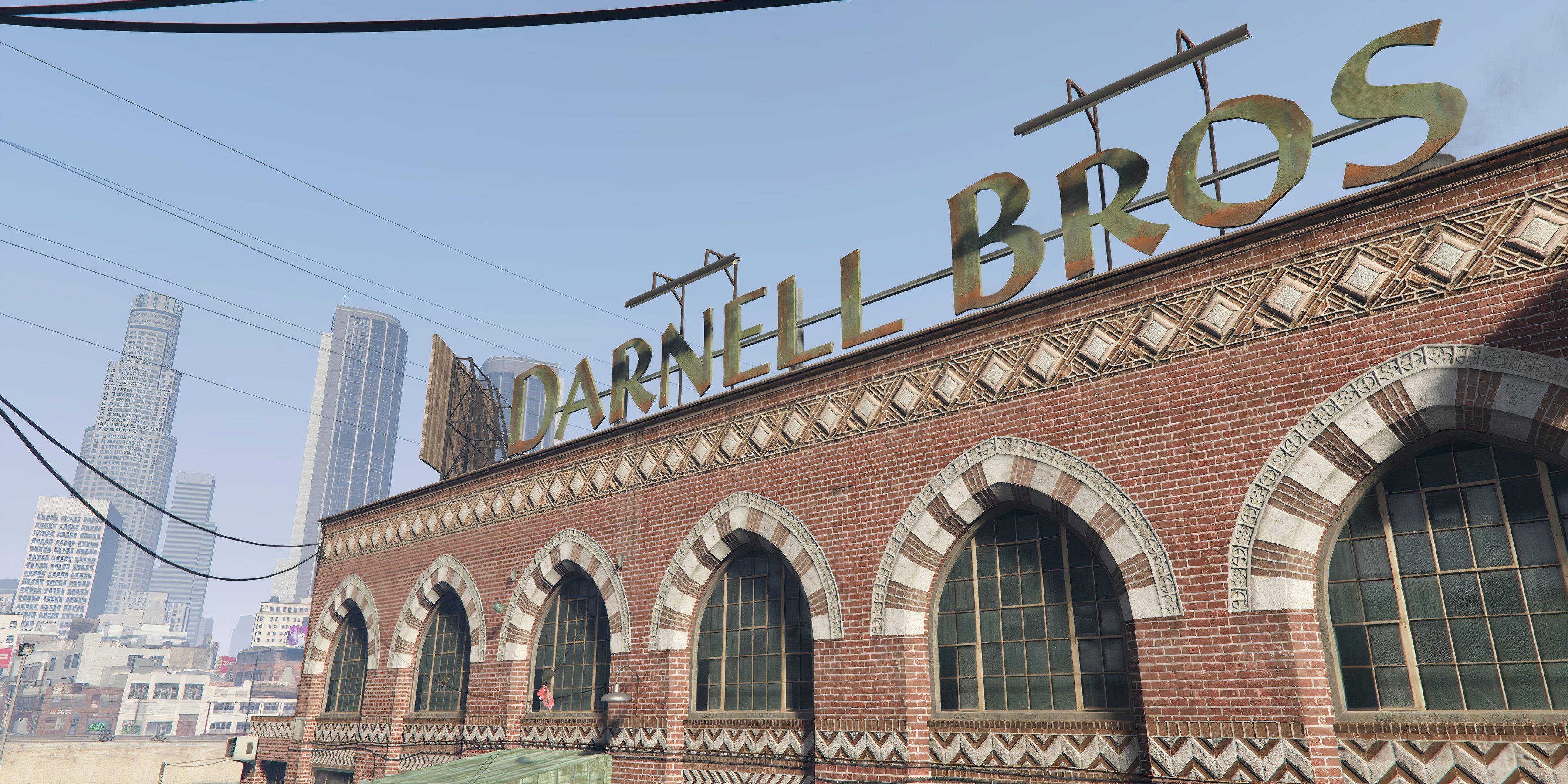 Feb 08,25GTA 5: Guide to Acquiring Formal Attire In Grand Theft Auto 5, after assisting with the Jay Norris assassination, players must change into a smart outfit before proceeding with Lester's next mission – a reconnaissance job at a high-end jewelry store. This guide explains how to acquire appropriate attire. Utilizing Michael's Existing Ward
 -
May 27,25Chimera Clan Boss Guide: Top Builds, Masteries & Gear for RAID: Shadow Legends RAID: Shadow Legends continues to push the envelope with its updates, and the Chimera Clan Boss stands out as the pinnacle of PvE challenges. Unlike the straightforward, power-centric battles of traditional Clan Bosses, Chimera demands adaptability, precise turn management, and an understanding of i
-
 May 23,25"2025 Laptop Buying Guide: Best Times for Deals" Laptops are a significant investment, but you can ease the financial burden by timing your purchase to coincide with the best deals. While new models are constantly hitting the market, certain times of the year offer more affordable options, even for the latest models in 2025. With President's Day s
 -
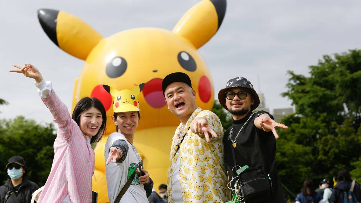 Feb 02,25Pokemon GO Fest 2025: Dates, Locations, and Event Details Get ready for Pokémon GO Fest 2025! Niantic has announced the dates and locations for this year's in-person events earlier than usual, allowing ample time for planning. Pokémon GO Fest 2025 Dates and Locations: Niantic has confirmed three locations for GO Fest 2025, all in June: Osaka, Japan: May